Institut für Organic Business (IOB) is a Japanese-German company founded by Natsuko Lempke, an organic expert in Germany. Their goal is to normalize organic lifestyles to create a better world for the next generation. They offer various online courses to help people build evidence-based and practical knowledge about organic.
IOB wanted to upgrade its branding, and I was responsible for a new logo, color palette, and typography.
Client
Institut fur Organic Business
Project Type
Branding Design
Project Year
2023
Roles
Graphic Designer
Ideation💡
Based on the hearing session with the CEO, I started off with the logo and sketched out a few logo options based on the brand’s goal and attributes.
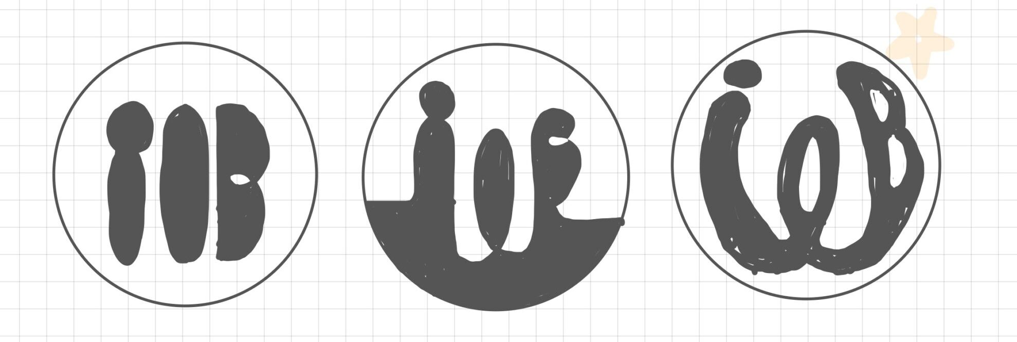

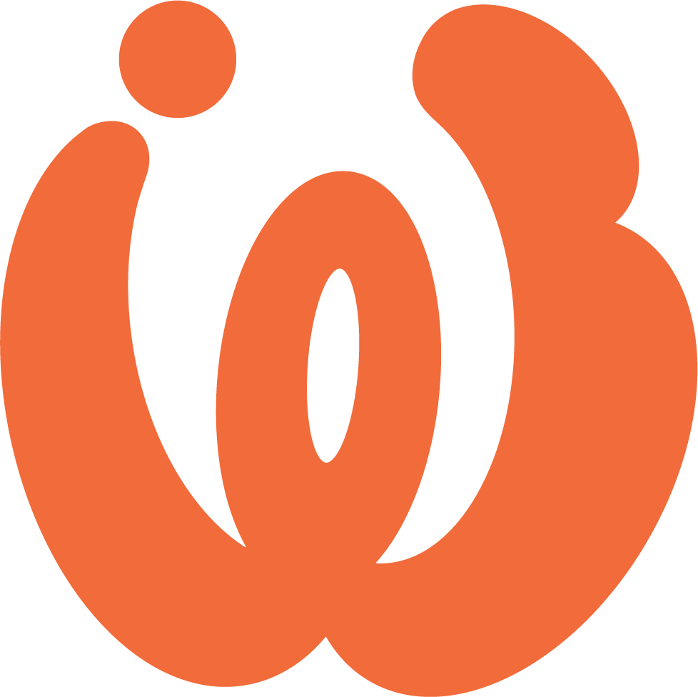
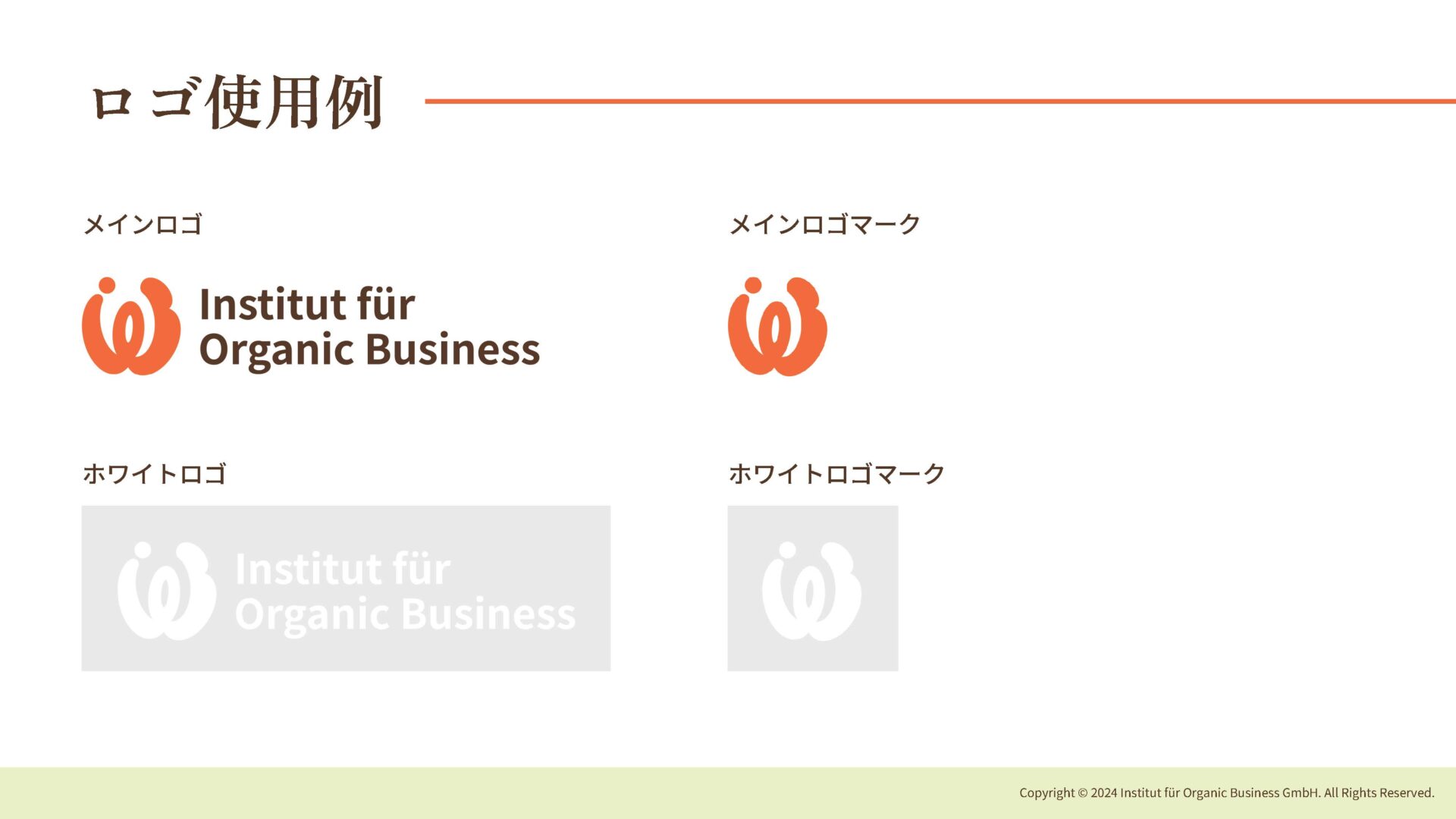
We decided to go with the third option – the brand’s Instagram name is “We Are IOB,” so I included “IOB” inside the letter “W” in the logo.
I felt that “we” was a keyword for the brand, as their business brings like-minded people together to achieve their dreams of positively impacting the planet with the power of organic. The logo represents the “connection” between people, creatures, and the earth.
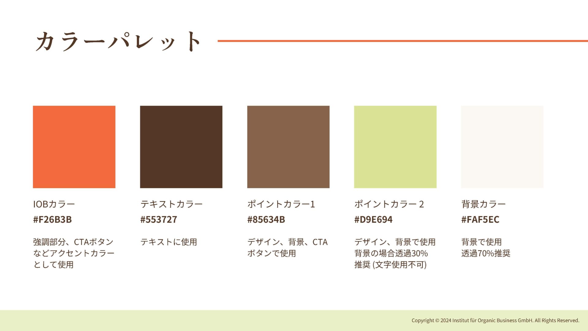
I changed the primary color from blue to orange to represent the bright future IOB would bring.
Final Designs✨
Logo
Brand Guidelines
New Branding Applications
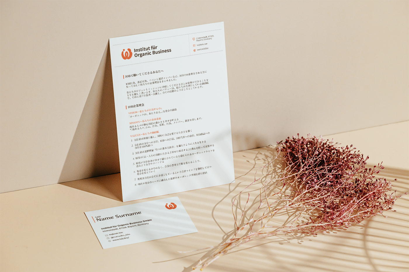
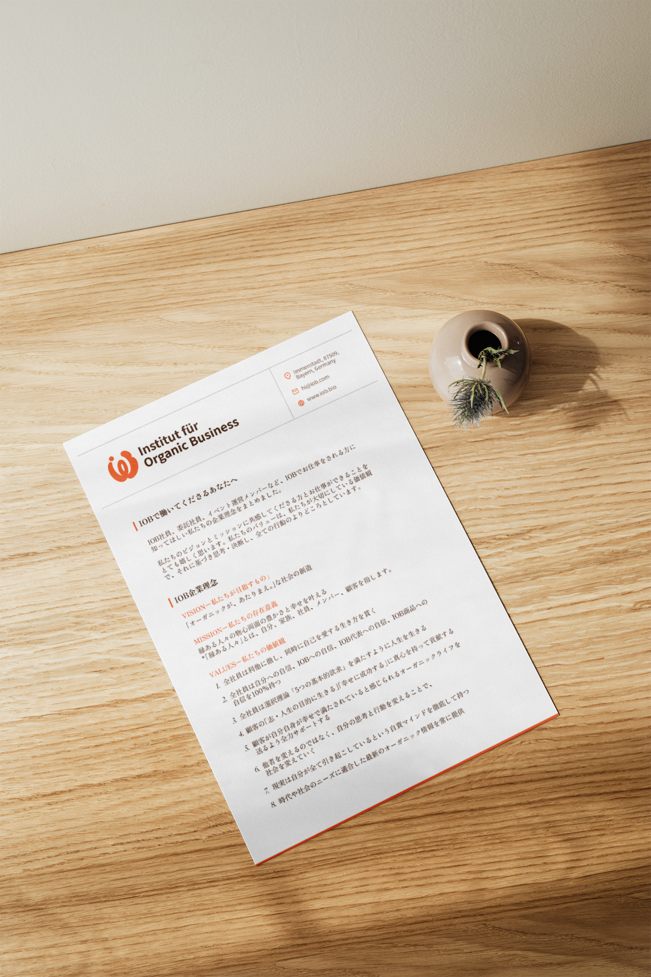
Letter head
T-shirt
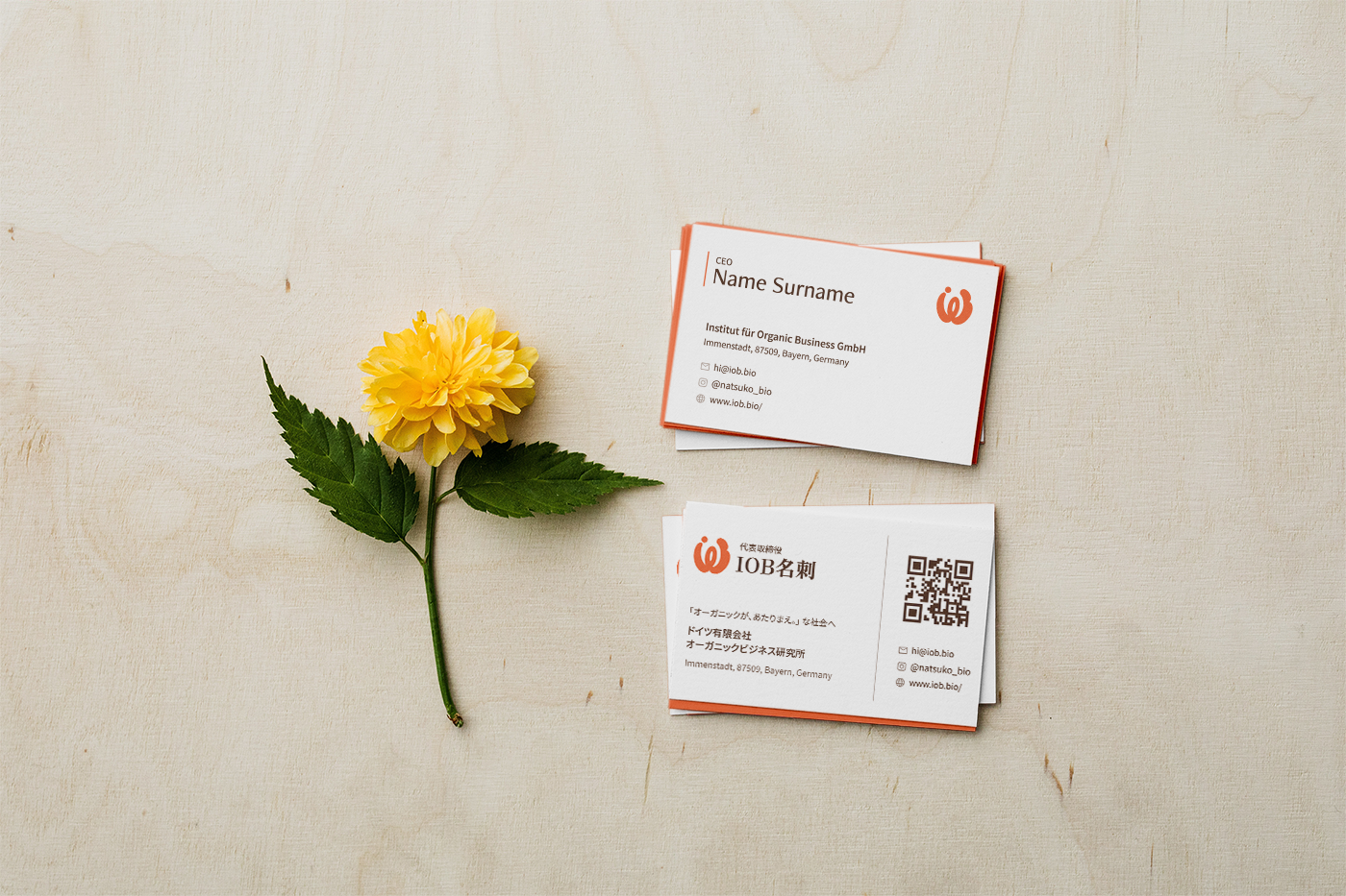
Business card