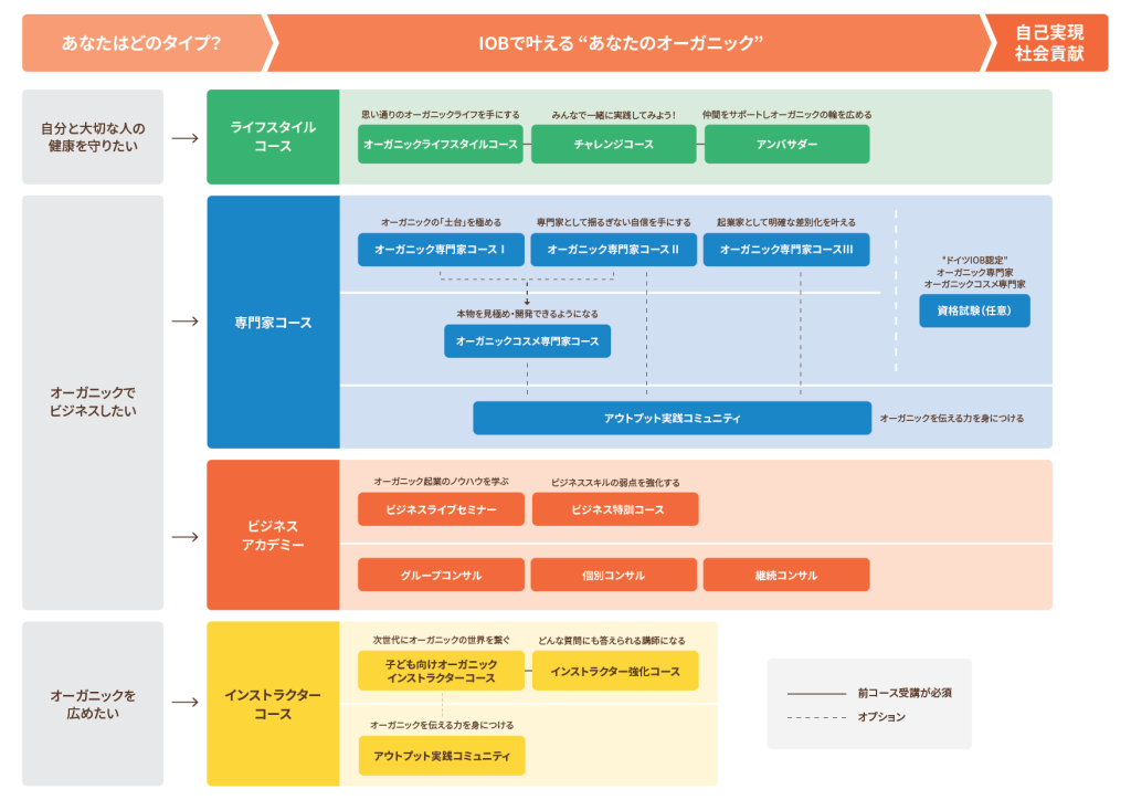
Institut für Organic Business (IOB) is a Japanese-German company founded by Natsuko Lempke, an organic expert in Germany. Their goal is to normalize organic lifestyles to create a better world for the next generation. They offer various online courses to help people build evidence-based and practical knowledge about organic.
Client
Institut fur Organic Business
Project Type
UI Design
Project Year
2023, 2024
Project Goals
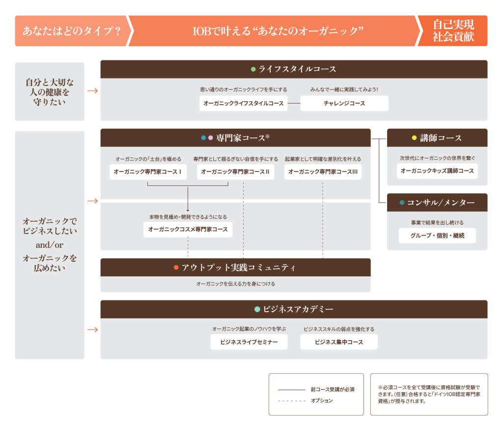
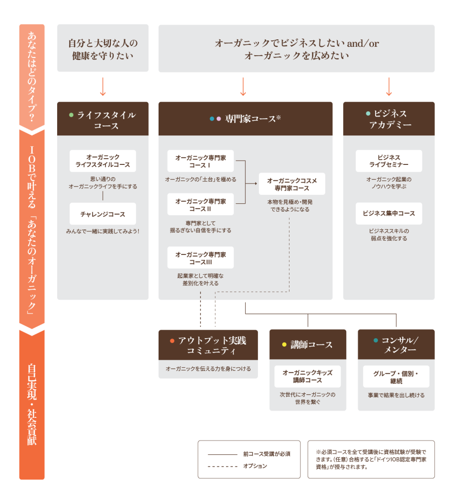
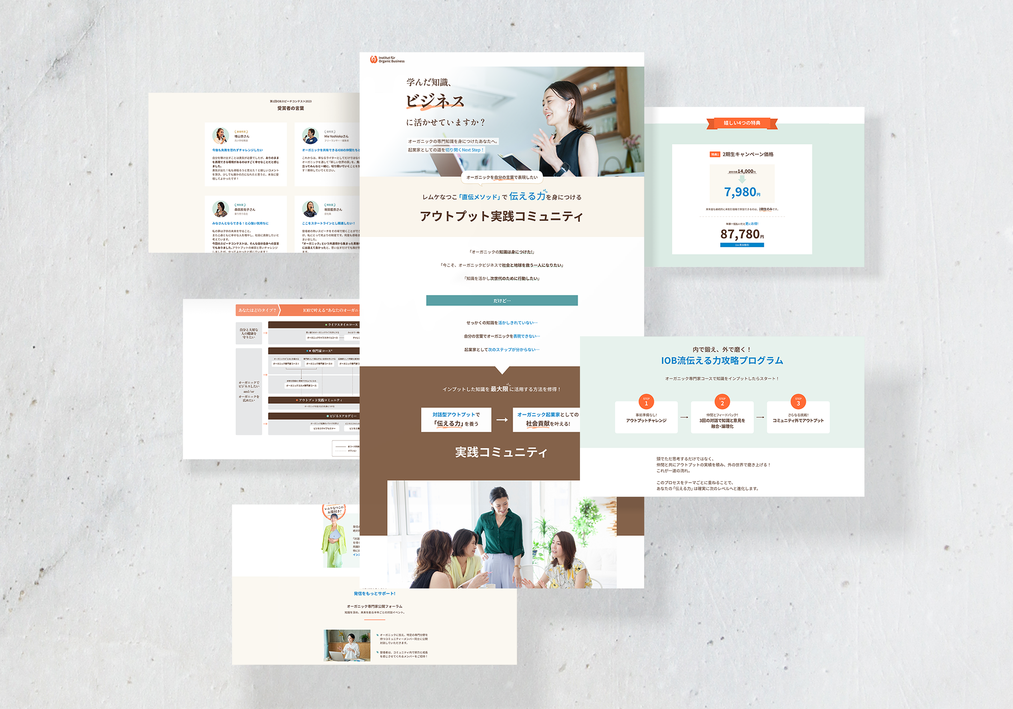
IOB established a new online course, “Output Community,” and my project was to design a responsive course landing page.
Target Audience
Japanese women in their 30s-50s who are organic business owners and want to gain communication and leadership skills and bring their business to the next level.
Challenges
The landing page was designed to be long so it convinces the audience. Therefore, the priority was readability and how we could make people spend time reading the content.
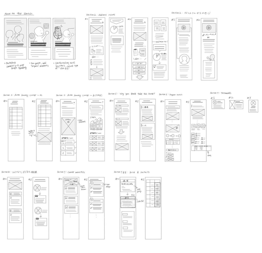
💡Ideation
Starting from understanding the content and structure of the landing page, I made the wireframes for the mobile. (mobile first design since 90% of users access through their phones.)
Design and Revisions 🎨
First, I worked on creating a few versions of the above-the-fold to decide on the design direction with the CEO and marketing director. The first option was picked, and I refined it by replacing an image that matches the course and improving the visual and typography.
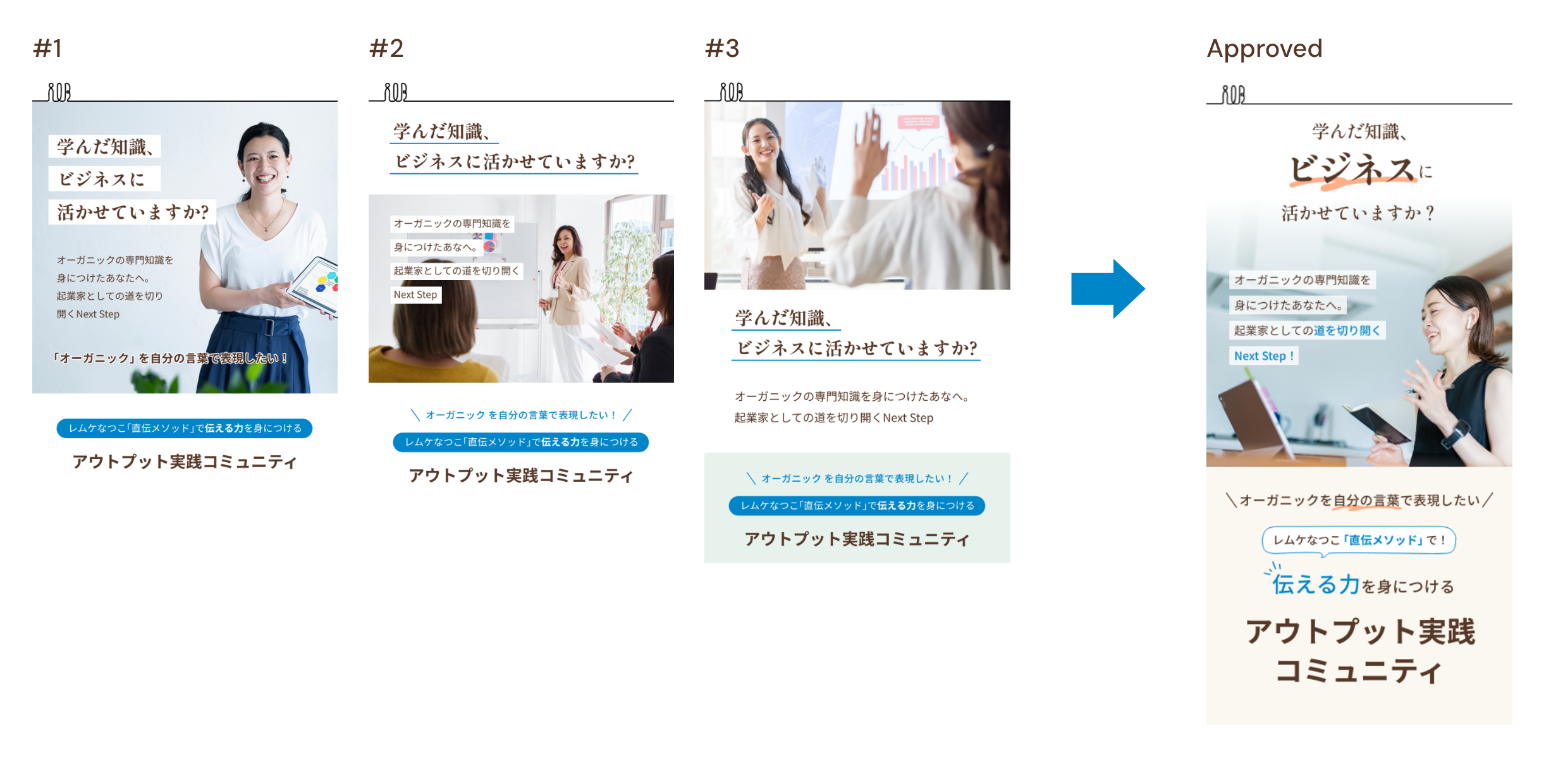
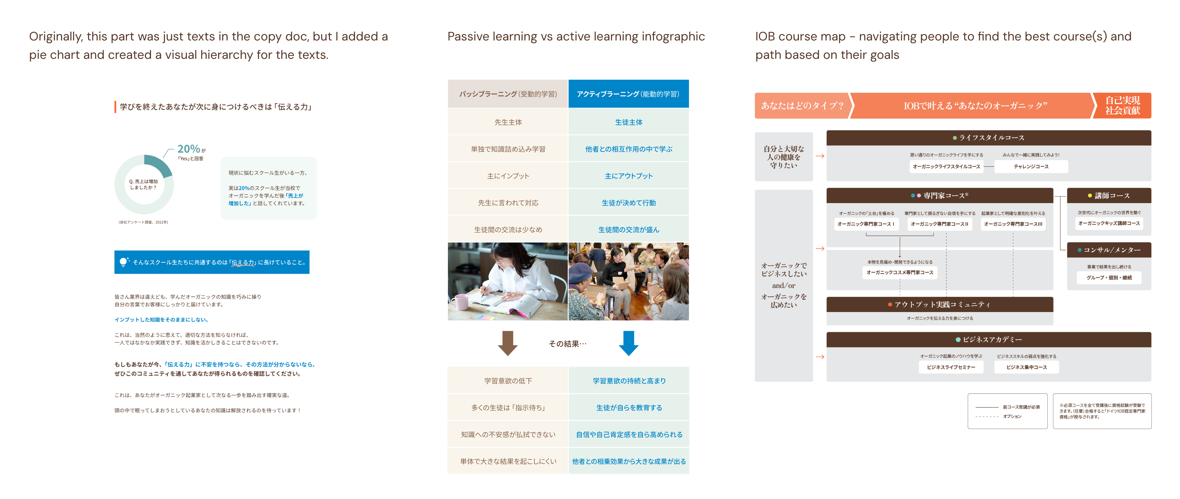
Based on the approved design for the above fold, I designed the other sections, submitted them for review, and revised them. Though there was a large amount of text, I used visual hierarchy, images, and infographics effectively to help people understand and engage with reading the content.
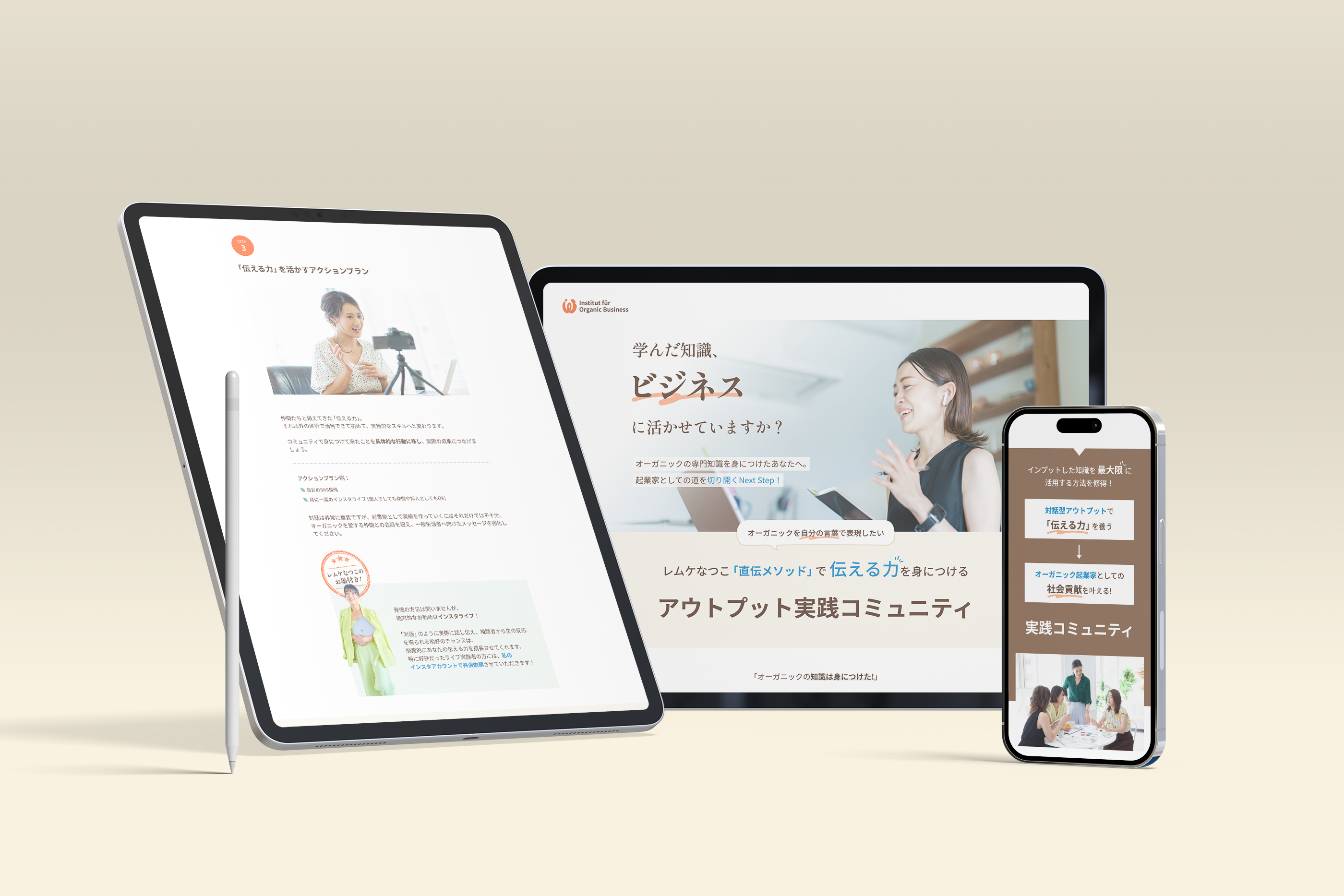
Final Design ✨
UX Considerations
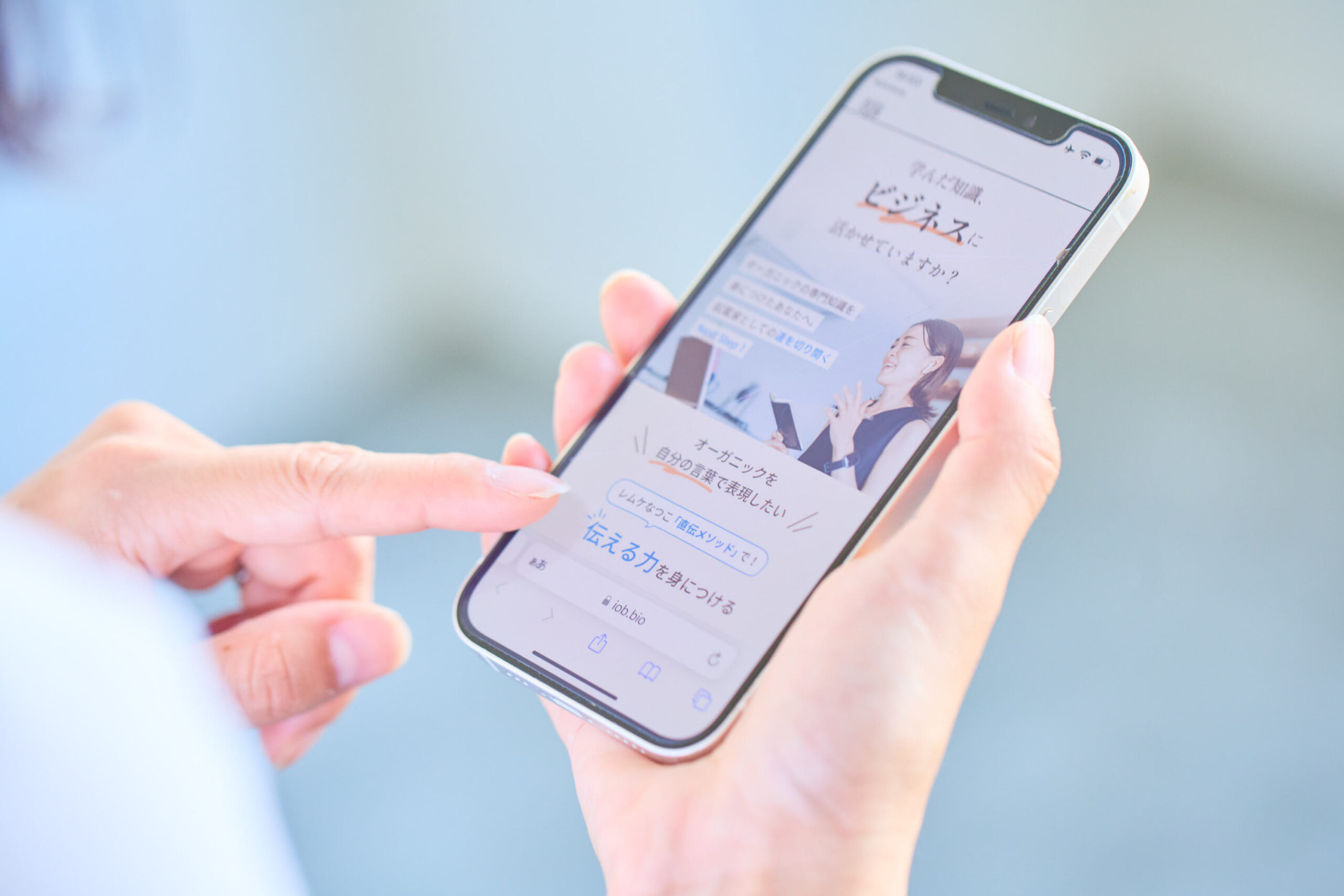
- Many of our potential customers experience weaker eyesight; the body text size was set to 18px to reduce stress with reading.
- When creating the responsive landing page, I paid attention to optimizing user experience; I used SVG for vector graphics to scale without losing quality and resized infographics for better readability.
- The landing page has been revised and updated 2 times since the course information was modified. I updated some designs to improve the visuals.
(It was too colorful and busy)